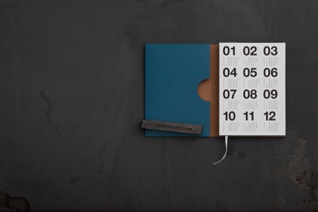
hope you all had i lovely christmas. i really love this time of year, especially when dutch printers come out with such beautiful planners. i love the thought that went into this beautiful diary of ‘Drukkerij Ando’. they’ve been publishing diaries for the past to decades, each year by a different designer or artist. this year Walvis & Mosmans designed it and what an incredible job they did.

here it is… my long awaited planner update. are you using a paper planner next year?

news_018

julie joliat planners / €21

planner3

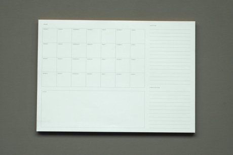
typotheque monthly planner / €8

Afbeelding 6

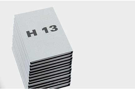
hinosx diary h13 / €21.50 (including vat and shipping in the netherlands)

IMG_1962

ilovebook.nl / €36.50 (currently sold out but there’s a waiting list)

linendiary1c

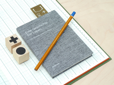
presentandcorrect.com / £15

if you have any recommendations on good planners, organizers, diaries or whatever you would like to call them: please leave a comment!

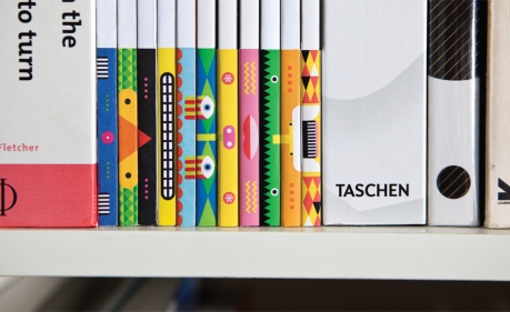
just saw this image over at designworklife.com (which is a great blog so check it out) and i had to share it with you all. Sydney-based design studio Naughtyfish designed these clever spines for desktop magazine which can be rearranged to create different ‘totems’. i love it!

naughtyfish_desktopspine1

oh hi! it has been a while since i last posted on this blog (almost a year). i was having difficulties with wordpress and being really busy didn’t help. i’m hoping to find some time to blog in the near future so stay tuned and thanks for sticking with me :-)

this week the selection of Best Verzorgde Boeken 2011 (best designed books) got announced. congratulations to all the winners! last year i complained about the poor communication by the organization and this year is no different unfortunately. as soon as i found about the selection i posted them on twitter and facebook but i feel the winners deserve a post on here as well.

i can’t find the jury rapport at this point but i think i’ll have to wait until autumn because that’s when the selection will be exhibited at the Stedelijk Museum in Amsterdam. the catalog will be published around the same time.

if you’re interested in book judging, the korean magazine GRAPHIC devoted an issue to the phenomenon. you can order it at the GRAPHIC website.

image belongs to Stichting Best Verzorgde Boeken

don’t know of i’ve shown this already, but here’s the man himself… Karel Martens. the dutch profiles channel on youtube is a wonderful source of information on dutch design.

friday i received the wonderful news that designer and typographer Karel Martens is awarded the Gerrit Noordzijprijs. many of you know that i’m a big fan of his work.

he will receive the prize on march 9 from the laureate of 2009, Wim Crouwel. the award ceremony starts at 16.00 pm in the auditorium of the Royal Academy in The Hague.

about Karel Martens

Martens received the prize, named after a type designer Gerrit Noordzij, for his achievements in both typography, teaching and publishing. he designed numerous books and covers for SUN Socialist Publishing Nijmegen, OASE, stamps, coin designs, signage, telephone cards and made typographical experiments. he started teaching in 1977. first at the ArtEZ academy in Arnhem and later at the Jan van Eyck academy in Maastricht. he founded the Werkplaats Typografie, a masters programme typography in Arnhem. In 2009 Martens became guest lecturer at Yale University School of Art for the prestigious graphic design program. Martens was frequently awarded for his work, including the Dr. A.H. Heineken Prize for Art in 1996.

about the Gerrit Noordzij prijs

The Gerrit Noordzijprijs is an initiative of the Master and Media Type of the Royal Academy, organized in collaboration with Museum Meermanno and under the auspices of Dr. P.A. Tiele Foundation. The prize is awarded once every three years. the price was previously awarded to Gerrit Noordzij, Fred Smeijers, Erik Spiekermann, Tobias Frere-Jones and Wim Crouwel.

if you want to know more about Karel Martens, you can watch this interview or read more about his book Counterprint.

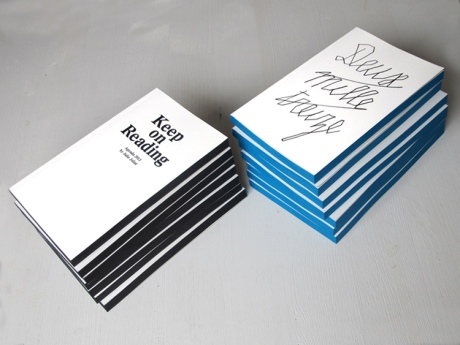
let me start by saying this book is expensive, but wow it does seem worth it! first of all it’s not just one cookbook but there are six volumes packed with beautiful photography, extensive techniques and background information. if you’re a Masterchef fan like many of us are, than this is the real deal.

now, i’m not at all too fond of cookbooks, usually it’s all about photography and the typography is erm… a bit crappy? i don’t know if this book is any different when it comes to typography and overall book design but when i saw this video, i knew it deserved a post here.

just to be clear: i don’t own a copy, i’m not a huge cooking talent and i don’t have the money to buy this but how i would love to just briefly browse through it.

http://vimeo.com/24381453

if you’re in the Netherlands that is! you can now enter the best designed books election if you designed a book that was published in 2011. the competition is not only open for book designers, publishers, clients and printers can enter as well.

if you want to enter you have to fill in a registration form that can be completed online (dutch). you have until january 4 to ensure that your design will be competing, so hurry up! good luck everyone, would love to see some iloveboeken followers win!

sorry if this post is a bit late, i got caught up in all of the holidays hoopla. hope you all had a merry christmas!

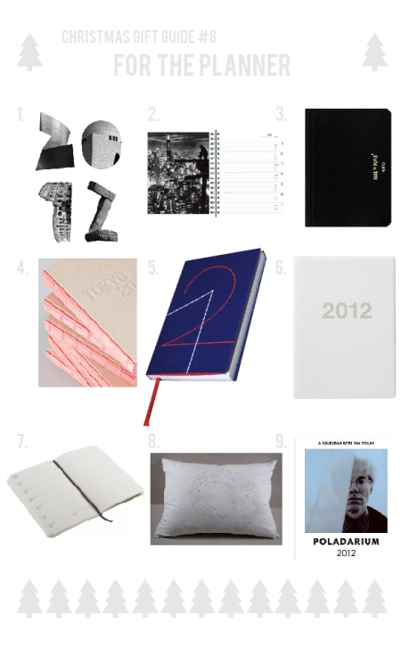
1. julie joliat 2012 agenda 2. new york agenda taschen 3. back to paper brepols 4. tokyo design agenda 5.  typotheque pocket calendar / sketchbook 6. muji 2012 a5 calendar 7. moleskine weekly calendar 8. calendar for insomniacs 9. poladarium calendar